Greetings from Mita!
Currently building AI-native creative tools for design agencies @ Ideate. Based in SF.
Previously, I designed at Apple and LinkedIn and worked across early stage startups in climate tech and health tech. I'm also an ex-founder and have been part of accelerator programs at Princeton's eLab and Cornell.
I'm drawn to emerging interfaces, wearables, health tech, and consumer apps, and I love rapidly prototyping across design and code to bring abstract ideas to life. I'm looking for my next role - you can reach me at mitaelan07@gmail.com or @madhumita.elan.

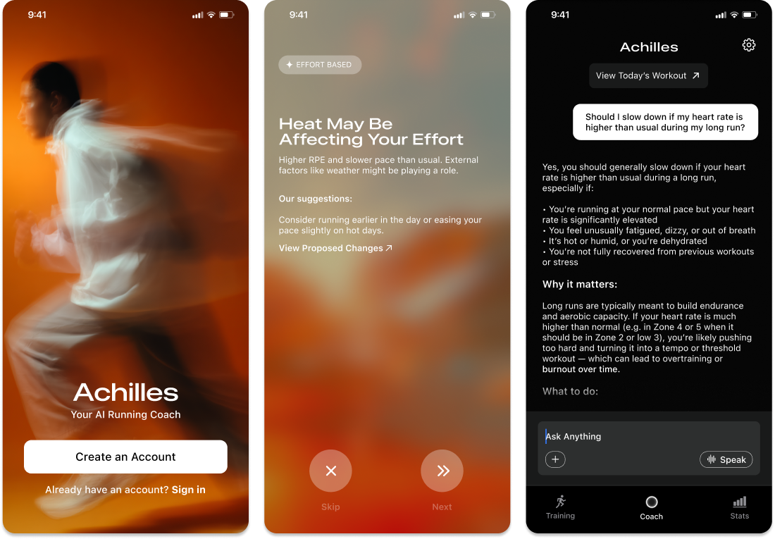
Most training apps ask a runner to answer a dozen questions before they see any value. Achilles gets them from account creation to their first real interaction fast, saving deeper personalization for once they're already in motion.
Most runners already have a plan — a coach's PDF, a template — they just can't act on it day to day. The Training Hub parses what they upload into a structured week, with today's workout front and center.
Rating a workout shouldn't be a one-way action. Every rating feeds directly into the next insight or adjustment, so a runner can see their feedback actually shape their plan, not disappear into a log no one reads.
Insights and plans only go so far without room for a runner to ask why, or push back. Coach is where a runner can question a recommendation, report how they're feeling, or dig into a data point directly — the same way they would with a real coach.
Personal bests, training volume, and countdown-to-race context, all in one view — so improvement isn't just implied by the plan working, it's visible.
We initially considered voice AI coaching, thinking it could create a more interactive experience closer to an in-person coach — and Apple announcing Workout Buddy (WWDC 2025) partway through our build seemed to back that up, though even Apple framed it as motivation, not real coaching.
Every insight follows the same structure: a signal in the data, domain knowledge connecting it to a cause, and a recommendation tied to both. Slower pace on a hot day isn't a fitness drop, it's a heat effect. A heart rate spike after three hard days isn't random, it's fatigue — but only when there's enough signal to say so with confidence. When there isn't, Achilles doesn't guess. It asks.
We went to NYC run clubs directly and recruited runners fitting the exact problem: training for a race, on a generic plan, no coach. That specificity mattered — testing with runners who already had a coach wouldn't have told us whether the coaching held up. 50 signed up for early access and ran a TestFlight beta with real training data — real paces, weather, fatigue, not simulated scenarios.
Not every runner trains with a smartwatch — for many first-time racers, a phone is the only device they have. That meant a chunk of Achilles's richest signal (heart rate, HRV, sleep) didn't exist for them. Rather than guess at fatigue from pace alone, we leaned on what was real: a quick RPE rating and a "how did that feel" after each run. Not as rich as sensor data, but enough for some insights — while staying honest about what wasn't available without a wearable.
The design work wasn't adding more numbers — it was figuring out which signal mattered right now, for this person, and saying it in a way that felt like a coach, not a report.
An AI that guesses is worse than one that asks. Every time Achilles didn't have enough context, we designed it to open a conversation instead of fill in the blank. That restraint is what makes the difference between a tool runners trust and one they ignore.
Some injuries — the ones runners downplay — need a human in the loop. The next step is connecting runners with real coaches when the system flags something serious enough to warrant it. Not replacing the AI layer, but knowing when to escalate beyond it.
This is just a snapshot of the entire design process.
Reach out to mitaelan07@gmail.com for the full story!

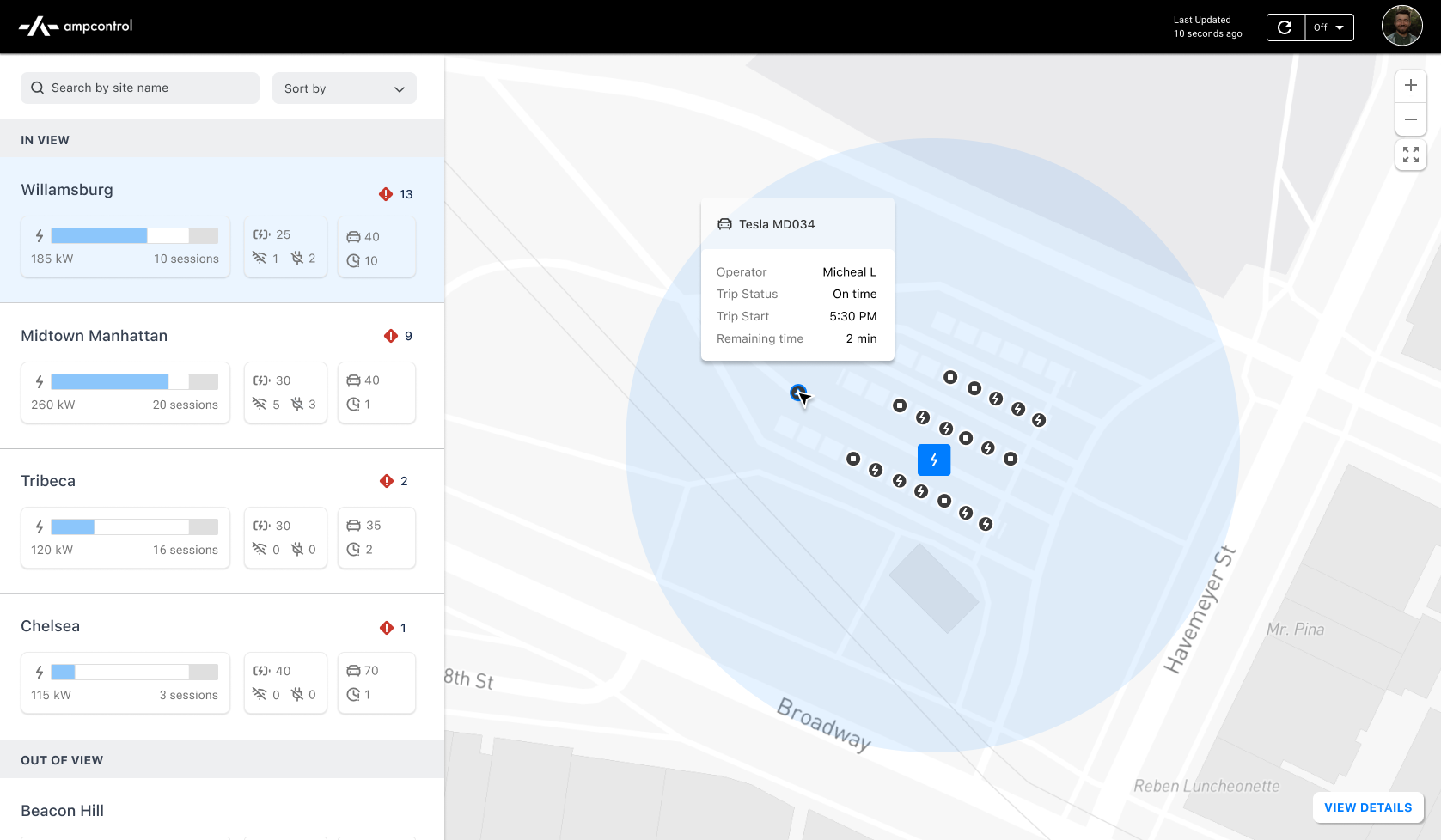
Ampcontrol's original dashboard
A map view providing a global overview of an organization's charging networks with zoom/pan capability, alongside a detailed list view showing power utilization, asset counts, hardware issues, and more for each network.
The ability to sort by issues and alerts relevant to ground operators.
To simplify complex data presentation, I used icons for clear visual communication and integrated tags in hover and select states for added context — implemented in the list view and map pop-up modals for quick access to vehicle and charger details.
Operators can track active hardware issues across all sites, view alerts by location, monitor progress, access details, and route issues to the right teams to keep operations running smoothly.
I conducted 3 panel interviews with teams using ampcontrol and found that operators want:
A key challenge here was selecting the most critical KPIs to help operators quickly assess site performance, while balancing screen real estate between the map and list view — surfacing meaningful insight without overwhelming users.
A few iterations that got us there:
A slimmer list view lost key details — operator feedback showed metrics like faulted connectors and trip delays were essential.
A table format let us show more at once, but testing showed it wasn't scalable and required too much focused reading. Color-coded map assets, meant to help, proved overwhelming without a clear hierarchy.
Splitting data into two pages showed the right amount of info per screen, but required operators to tab between charger and vehicle data. Users wanted everything visible at once — but given our timeline, showing all the necessary data, even split across tabs, mattered more than solving for zero clicks.
Ampcontrol was built on Material UI for ease of implementation. It wasn't the system I would have chosen, but we didn't have time to rebuild from scratch. I focused on improving color, typography, and details like cards, icons, and dropdowns to raise the level of polish without slowing down engineering.
This was a high-impact project I took on early at Ampcontrol, where I learned to collaborate cross-functionally, advocate for design quality, and rapidly iterate, test, and ship.
With more time, I would have explored deprioritized features like long-term charger health analytics, fleet-wide insights, trip feedback, accident prevention, route previews, and proactive tools like charging queues and scheduled maintenance reminders.
I also would have tracked additional success metrics — dashboard usage frequency, on-time trip departure rate, issue detection and resolution time, fleet and asset growth rate — to evaluate long-term success.
This is just a snapshot of the entire design process.
Reach out to mitaelan07@gmail.com for the full story!
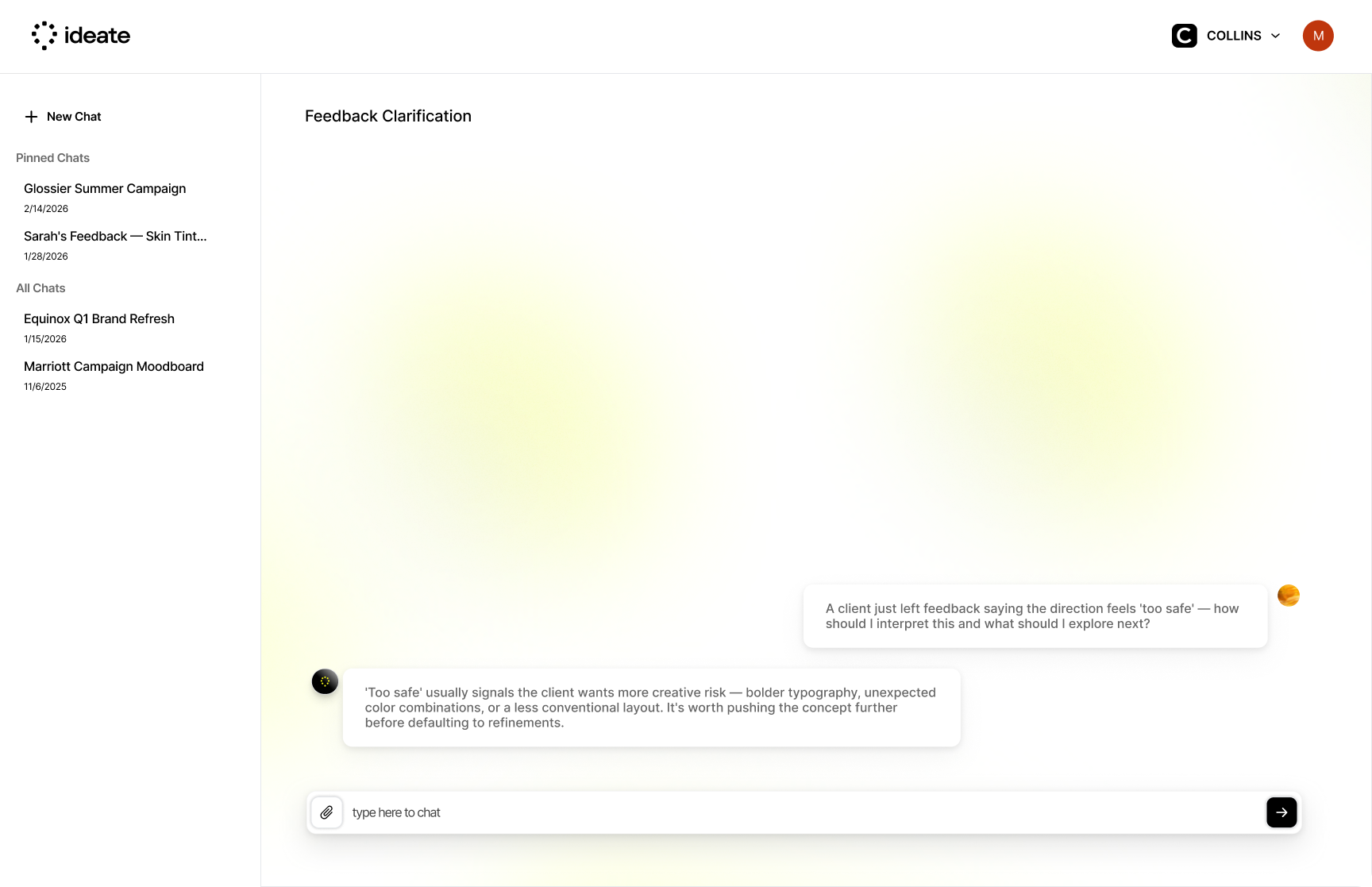
Sage reads your client feedback and turns it into actionable insights and next steps — not a rewrite, an interpretation of what the client actually means. This is still the entry point for most designers. The feature that earns trust before the others can do their job.
The original plan was passive — let Sage learn through chat history. But chatbot memory has real constraints, so I designed around it instead. Designers create a client profile at the start of each project and Sage anchors every conversation to it. Each session opens with: who are you working with today? Turns out explicit context a designer builds intentionally is more reliable than anything a system tries to infer.
This is where Sage stopped being reactive. When a designer is writing a comment or drafting a brief, Sage is already reviewing it — surfacing suggestions in real time, before anything gets sent. The design challenge was restraint. Proactive AI that's too eager becomes noise, so we had to be deliberate about when it speaks up and how it shows up without making the designer feel second-guessed.
Persistent, context-aware, always accessible. Sage is now a presence across the entire suite — not a screen you navigate to. The chat isn't the product. It's the interface through which everything else is accessible — usable on top of any tool, without ever breaking flow.
The concept was simple: drop in a confusing client comment, get back an interpretation. It worked, technically — but it was guessing every time, with no context on the client or how they gave feedback. That echoed a problem designers already had: juggling multiple projects made it easy to lose track of how different clients communicate and their preferences.
A limitation while building this agent was that Sage's memory wasn't reliable if it just learned from chat history — the more a conversation grew, the more early context got lost or summarized away.
To design around this, I created a flow to help designers set up a client profile up front, at the start of a project. Sage always checks that profile directly, rather than trying to piece things together from old messages — so the context stays intact no matter how long the project runs. A few decisions shaped how that setup actually works:
Client setup happens as part of starting a project, not a separate step to remember later.
A founder and a marketing lead don't get flattened into one profile — Sage accounts for how each person actually gives feedback.
Designers can view and edit accumulated knowledge and past sessions within a client's profile at any time — not just set it up once and hope it stayed accurate.
If a designer starts asking questions with the wrong client selected, they can just switch the client selector — the entire conversation carries over to the newly selected client's context, rather than forcing a restart.
When we started, a standalone chat felt like the natural shape for an AI feature. It's easy to scope, easy to ship, and it's what users expect. But easy to ship and actually useful aren't the same thing. The chatbot screen taught me that the most important design decision for an AI feature isn't what it does — it's where it lives and when it shows up.
The client memory limitation was frustrating at first. We wanted passive learning; we got structured onboarding instead. But the forced explicitness turned out to produce something more reliable and more trustworthy. The designer built the context intentionally, so they trust it. That's worth more than a system that inferred something and might have gotten it wrong. I've started thinking about technical constraints less as blockers and more as redirects — they push you toward solutions you wouldn't have considered otherwise.
This is just a snapshot of the entire design process.
Reach out to mitaelan07@gmail.com for the full story!
Ideate is building a suite of tools for design agencies to streamline creative workflows and manage operations end-to-end, from early concepting to execution. I led the redesign of Synthesis as the founding designer — turning a passive moodboarding tool into a collaborative, decision-making workflow for designers.
When I joined, the team had just shipped an MVP — of the initial signups, only 32% created a board, and most dropped off before uploading content or returning to collaborate.
Between blank canvas paralysis and no built-in content discovery within Ideate, designers were defaulting to Pinterest before ever getting started.
Teams relied on meetings and external docs to make decisions, even after the moodboard was built.
To address early drop-off, the work focused on two things: reducing the friction to getting started and helping users understand the value of the platform before they gave up on it.
The first step was making it easier to pull content from the web without the download-and-reupload loop. A browser extension let designers grab content directly from any site, which increased uploads but also made it clear that native content within the platform was the real need.
To bring content fully into the platform, a curated public feed let users discover and save inspiration without leaving Ideate. Quality was a deliberate choice — content was sourced from trusted design publications, museum archives, and public libraries, giving it a clear edge over Pinterest's repetitive algorithm.
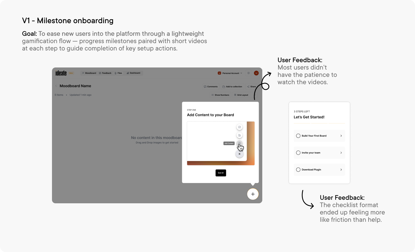
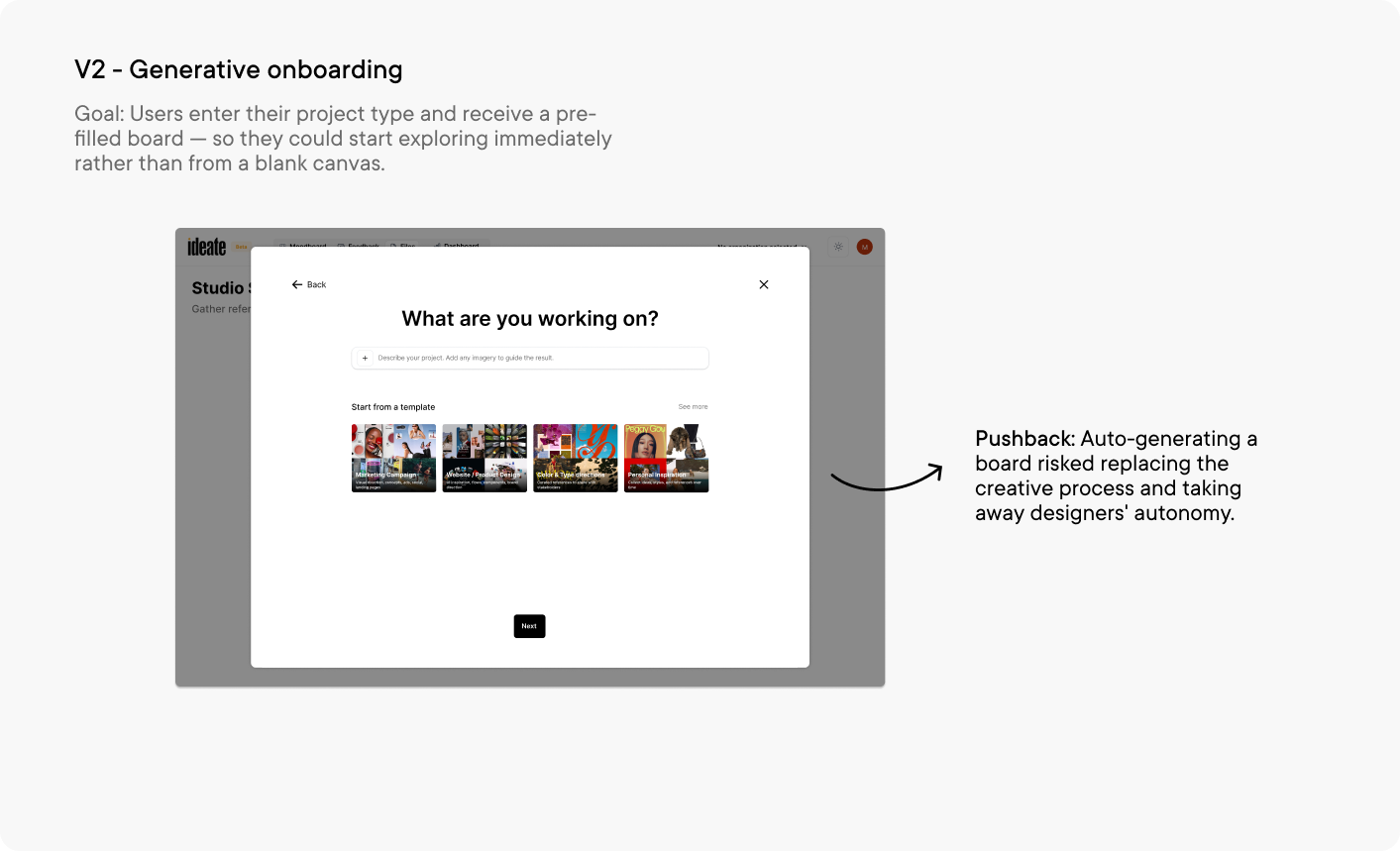
I wanted an onboarding experience that eliminated blank canvas paralysis and helped designers discover Ideate's full range of offerings before they dropped off. Swipe through to see my iterations below.
Since feedback was scattered and decisions were happening outside the tool, I wanted to bring alignment directly onto the board — giving teams the tools to give feedback, track decisions, and move forward without ever leaving Ideate.
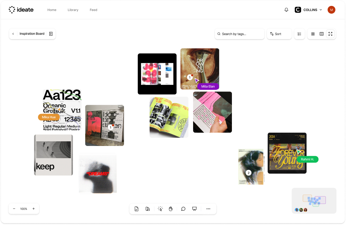
Inspired by Figma's canvas, this mode brought real-time collaboration directly onto the board — letting teams see where collaborators were focusing, whether working live in a meeting or asynchronously. It built on Ideate's existing commenting feature, giving teams a familiar and fluid way to work together.
A centralized feed that surfaced incoming comments and feedback in one place, helping teams spot trends, stay aligned, and respond without digging through the board.
Liking content translated directly to approval — a core part of how design teams align. Teams could see who was approving what and sort content by most liked, making it easy to identify what to move forward with.
A dedicated top-of-board area where teams could surface priority items and create a shared focal point for what mattered most.
A clean, distraction-free view that let teams walk clients through the board in a focused, presentation-ready format.
Without a roadmap or dedicated PM, I stepped into that role — scoping features, driving prioritization, and aligning the founding team around product decisions amid a lot of competing viewpoints.
This project pushed me to lean into AI tools to fill gaps and accelerate the process — from drafting wireframes to rapid concept testing — fundamentally changing how I approach early-stage design work.
Mentoring a marketing intern transitioning into product design helped me develop as a leader — delegating work, collaborating cross-functionally, and co-leading a redesign of our design system documentation.
This is just a snapshot of the entire design process.
Reach out to mitaelan07@gmail.com for the full story!
Synthesis let teams build mood boards from curated content or their own Agency Libraries, gather async client feedback directly on the board, and present and hand off without leaving the tool.
We saw a high drop-off rate once a board was created — boards weren't sticky, with no week-over-week return. Digging into it surfaced two distinct problems:
Pain PointsUnlike Pinterest, Synthesis didn't offer content — designers had nowhere to start from. We built Agency Libraries and a public feed to close this gap, which improved traction but not enough.
Even with better collaboration than alternatives, Synthesis was one more tool to adopt. Teams could get away with Figma instead.
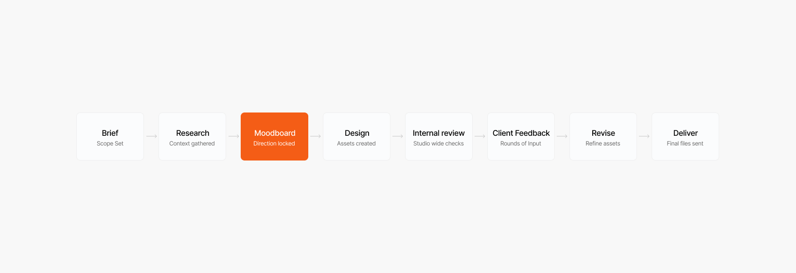
That insight is what led to Atlas — Atlas is a living canvas — a single spatial surface where a project's files, version history, status, and assets converge, built around how design work actually moves. It replaces a scatter of disconnected tools with one unified hub.
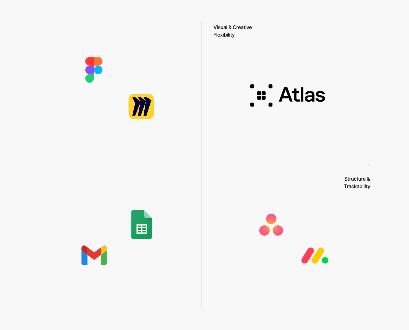
Existing tools force a tradeoff: Figma and Miro offer visual flexibility with no structure, while Asana and Monday offer structure with none of the visual flexibility design work needs. Atlas is a solution that delivers both.
They need a tool that works in a messy, fluid environment and considers fault tolerance
They want a system that reflects how creative work actually unfolds, not a linear task pipeline.
(Manual tools like Excel, Google Sheets, etc reduce this)
The moment a tool adds more process than value, designers switch to the simplest option.
Every touchpoint on the canvas — files, moodboards, to-dos, ops data — lives inside a node.
The first question was what a node needed to hold at rest versus on interaction — what's visible at a glance, and what only surfaces on hover. We didn't want to bombard users with fields to manually maintain, so we landed on three things a node can track, all optional depending on node type:
For a design file, re-uploading a version (after editing elsewhere, like Figma) keeps a running history without manual logging.
For tracking changes or discussion happening outside the node's source file.
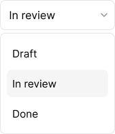
A simple dropdown (in progress, in review, done), Kanban-style.
Considered and cut. Early on, we experimented with making every node connectable, to show a general path of how work moved across the canvas. We cut this for general use — it made more sense as a targeted interaction pattern for specific flows (presentations, the AI generation flow, and grouping nodes into moodboards) than as a default behavior every node needed.
Sage began as a feedback translator in Synthesis, then grew into a persistent context layer — tracking clients, their working styles, and preferences. Read the full Sage case study →
The team pushed for Sage to live as nodes on the canvas — each conversation its own object, letting users ask one-off questions, make changes, and use the node as a kind of change log. I prototyped it, but my initial hypothesis held: user research showed these nodes scattered across the canvas and became hard to track. We moved back to a side-panel chat instead.
User research showed demand for AI-generated mockups and the ability to string together presentations quickly. Since Sage already had project and client context, its output could be more relevant than a generic third-party tool — and it meant one less tool to juggle. So we built generation in directly.
Designers need
PMs need
Financial, capacity, and health data surfaced directly on the canvas itself, alongside the creative work for that specific project.
What we're testing:
Before any code, I mapped out what the canvas needed to hold and how it would look
Since we were pivoting drastically, I wanted quick feedback before building it out fully — so I built a working version with Claude, deployed on Vercel, to get the canvas in front of real users fast.
Used in demos for all 5 pilot agencies to showcase what was coming next, ahead of a polished build. A real, working canvas — not static mockups — gave pilots a tangible sense of direction and helped move sign-on conversations forward.
When I joined, the CEO had a vision for a suite of tools to tackle the gap we'd found, starting with Synthesis. I was doubtful, but didn't have a clear enough read to push back on gut feel alone — so I spent time actually validating it: digging into behavioral data in PostHog to find where users were dropping off, and talking to them directly to understand where the tool fell short. That combination is what built the case to pivot to Atlas.
After already sinking time into building Synthesis, I didn't want to lose that momentum waiting on the usual design-to-dev handoff before we knew if the new concept held up. So I vibe-coded a working prototype to test it quickly and get concrete feedback on what didn't feel intuitive — giving us something real to react to before we committed to building it properly. That process ended up cutting through a lot of the normal design cycle for me, and I've stayed more involved in the front end since, making changes and pushing PRs myself.
This is just a snapshot of the entire design process.
Reach out to mitaelan07@gmail.com for the full story!
Members are invited by their provider to join PTPAL, verify their identity, and are welcomed with a concise overview of the platform's features and usage.
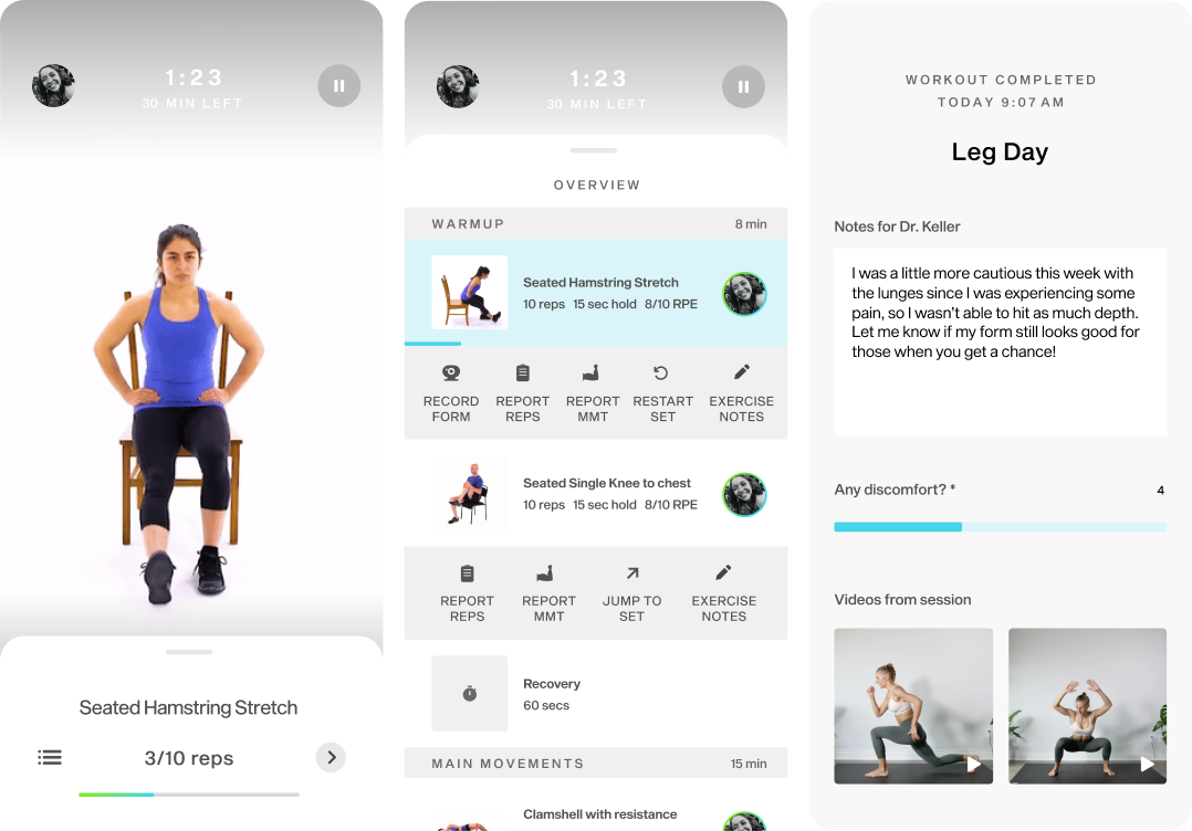
Members can pair the app with their TV for a more immersive workout experience, improving visibility and focus on proper form during exercises.
Members can follow guided exercise videos to ensure they perform exercises correctly at home.
Members receive visual cues, track sets and reps, and get real-time audio feedback for corrections during exercises.
Members can log workout details, such as reps and pain levels, to share with their provider.
After workouts, members can leave feedback, share videos for review, and message their provider anytime using the in-app messaging service to stay connected.
Over time, members can track recovery progress, review achievements, and monitor goal-based improvements.
In the winter of 2021, I had a major knee injury that shaped much of my college experience. I eventually recovered with help from my physicians and physical therapists, but the journey was hard, with a lengthy recovery, confusion over exercises, and anxiety from inconsistent programming. It showed me real gaps in how patients are supported between sessions.
In addition, in 2023, the physical therapy software market was valued at USD 1.1 billion. With few well-designed solutions offering real-time guidance between PT sessions, I expected my product to make a significant impact within this market.
ResearchTherapists see motivation plateau when patients’ bodies start feeling “normal,” which disrupts their programs and prolongs recovery.
Therapists want to track progress outside sessions, but patients lack a simple way to log and report workouts, so consistency slips.
Patients want more guidance and feedback at home to make sure their form is right.
The first version featured a mobile app paired with an Apple Watch app to provide users more autonomy while following the app's guidance.
Feedback & Insights
It wasn’t clear the watch added enough to justify keeping it in sync with the mobile app.
Pop-ups for guided videos and exercise details lacked hierarchy, overwhelming users with too many tabs and inputs.
Videos helped patients remember exercises, but they weren’t sure they were doing them correctly and wanted real-time feedback.
Based on feedback, I tested a new version of the concept on a TV interface, allowing patients to watch themselves perform exercises in real time alongside guided videos.
Feedback & Insights
I worked with physical therapists on a concept that uses AI and 3D projections to track exercises and give real-time feedback, making at-home training more accurate.
Some participants said the interface resembled a tablet, so I reworked it around TV UI guidelines.
I designed an experience using existing home technologies, combining three devices: a motion-tracking camera with lidar sensors, a mobile phone for feedback, and a TV to display video footage of the patient.
A few of the wireframes from the final version
With core interactions defined, I mapped out the final version of PTPAL, including key features like onboarding, home page, exercise details, TV workouts, and progress summaries for wireframing.
It was the most challenging and rewarding project of my undergraduate career, and it sparked my interest in how interaction design can foster connection.
I'd track engagement, exercise adherence, confidence in form after real-time feedback, and recovery outcomes to see how it truly impacts patients.
This is just a snapshot of the entire design process.
Reach out to mitaelan07@gmail.com for the full story!